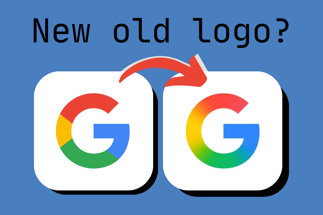
I know you didn’t notice but now you will notice every time you look at it. Google just updated the iconic Google ’G’ for the first time in 10 years.
What they have done is made the classic logo, and added a gradient blur on top of it. Opinions around social media are mixed as people are really attached to the classic logo. Graphic designer of thesilicon here, I can say that I am not really a big fan of the new logo, I do understand that they are trying to bring continuity and blending between all of their services. But, honestly I don’t like it. The gradient looks makes the red especially feel too long and almost took orange. What I am thinking, Google changed the logo as they are entering a new era. The era of Ai. This is because this logo really does resemble the other gradient logo. Google Gemini. Also, with Material 3 Expressive (read the before articles) they have introduced some blurs in the software similar to the rumored iOS 19 rumors. Also, Google has been experimenting with AI on the google hoke page by removing the ’Are you feeling Lucky button” with an AI button. Also, Google may use Gemini in YouTube to put advertisements in the most ’important’ parts of the video.
Is the logo good or is it absolutely horrible? Let us know below 👇

Comments
Comments have been temporarily disabled